References - Not created by me
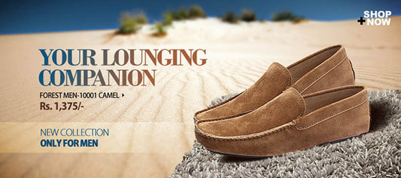
The first advertisement that caught my eye was this image that shows a pair of loafer/moccasin style shoes lounging on both a beach, and carpet. This ad effectively demonstrates the versatility of this style of shoe by showing them in an outdoor and implied indoor setting. The carpet may also be trying to tell the viewer that the shoes will make the ground beneath their soles feel like a plush carpet. The ad has a shallow depth of field, which keeps the viewers attention on the shoes and text that is located in the negative space in the sand. The text is a smooth and pleasing gradient that draw all of the colours in the ad together. The orangish-brown complements the deep blue well. The name of the colour camel written below also references the desert. The ad saying "only for men" makes the male demographic they are aiming towards compelled to buy them because if they are "only for men" it makes them very masculine, not feminine. Clearly by being "only for men" they are the classiest and most macho of basic brown loafers. This ad inspired me to make well use of negative and positive space, and aim towards a key demographic when creating an effective advertisement.
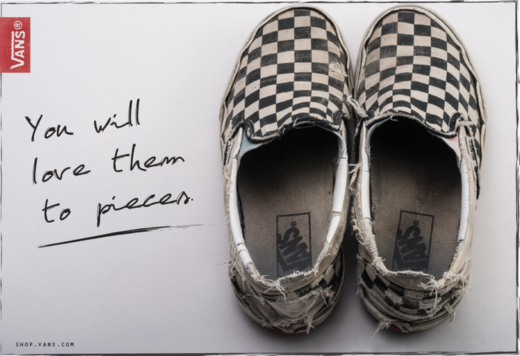
This was the next photo that I decided to pick because of its nostalgic and almost comfortable feel. I, and most likely many other viewers of this ad have had a reliable and well worn favourite pair of shoes, and they very well could be Vans brand shoes. Call me biased but those shoes are comfortable and come in like a million different colours. There's no doubt in my mind that most would love a pair of Vans sneakers to pieces. This ad conveys more of a message and feeling instead of slapping you with prices and information. While the actual shoes may have been well worn when the photo was taken, the intensity of the wear may have been dramaticized by editing. I like the handwritten font choice because of its sloppy appearance. It fits well with the sloppy shoes. But it's a good sloppy. The logo is subtle, and it kind-of just advertises their entire brand instead of one specific style. This ad inspired me to use interesting visuals and pair them with corresponding text styles and content to create emotion within the viewer.
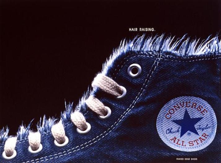
This was the third ad I chose, mainly because I loved the textures and visuals. To be honest the slogan didn't really click with me. I get what they were going for, like "Oh look we gave the shoe hair. It's raised. Hair raising haha." But what is frightening or extremely exhilarating about Converse shoes. We mostly associate hair raising with fear or alarm, so I'm not really sure. Maybe they were trying to imply that wearing these shoes will magically make your life so exciting your hair will just stand at attention all the time. Perhaps the advertisers wanted to keep the viewers attention by making them think about stuff like this. I'll stop rambling. Either way, the visuals for this ad are very nice because the text is subtle, and the shoe makes a nice leading line along the black negative space. The shoe has rich textures and a pleasing blue colour. The red on the converse logo is a somewhat muddled red, so it stands out but not to the point of making it a distraction. This ad showed me to try and make my message connect with the viewer in some sort of coherent way, not just add text and visuals that are so distant from the topic of my product. It also taught me to show the beauty and detail in both what I'm advertising, and the idea behind it.
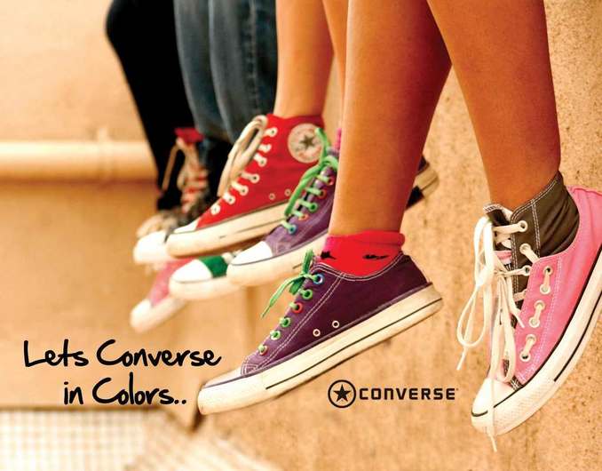
This was the final shoe ad that I drew inspiration from. I liked its shallow depth of field and variety of colours that go together nicely. The image and text both show the variety in their product, and it has a nice message that seems to bring a sense of community among those who like these shoes. The text isn't obstructed by visuals and is placed well in the negative space of the image. There is considerable contrast between the different shoe colours and the background which lets the product stand out. The whole ad kind-of gives me a vibe that reminds me of those middle school times where everyone and their brother had a pair of these shoes, and it, like the Vans ad, is pleasantly nostalgic. The lines on the wall and the line of shoes guide the viewer along the image. Overall this ad invoked some sort of emotional response within me, which is what I wish to achieve with my ad, and it shows off the product in a quirky and eye catching way. The positive message and youthful vibe is a plus in my book as well.
My Reference Photo and Finished Product

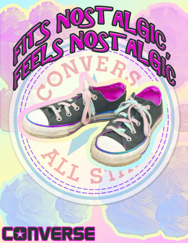
iThis is my finished shoe advertisement and the original photo that I took my shoes from. When designing my ad I kept the references I looked at in mind. I started with the original photo and I used the eyedropper tool and a soft feathered brush to patch up the scratched coloured stripes going around the shoe, and the white parts in an attempt to make the shoe look newer, cleaner, and more visually appealing. Next I selected the laces with the quick select tool and copied them onto a new layer, then used a large sponge tool to raise the vibrance on the now grey and dirty laces on my shoes. It made them pop and helped to highlight the fact that they were more than one colour. I then used my dodge tool to lighten the white parts of the shoe a little further, as well as the pink lining on the inside of the heel. When I was done, I took a very large burn brush and gave the entire image a slight burn to make the shadows prominent and the blacks a bit darker. I then used my quick select tool to delete the background and saved the file as a PDF so I now had a transparent image of just my edited shoes. Creating a new document that was 8.5 by 11, I created a new layer and added colour to my background. I went with a soft pastel coloured gradient that had colours similar to that of my shoe. I made it a diagonal gradient, then proceeded to make another new layer to place my shoes on. I added a stroke to my shoe image using the same gradient, but facing the opposite way for a trippy effect. This also helped the shoes stand out and look less sloppy. Afterward, I saved a PDF of the circular Converse logo and placed that on a new layer. I used my quick select tool, and colour range to alter the original logo to have colours that fit better with the style of my ad. I moved the logo layer under the shoes layer and turned down the opacity. Next I made another new layer and used a slightly transparent rose brush to add roses into some of my negative space. I added a stroke with the same gradient in again, another different direction to tie it all together and then a satin finish and purple colour overlay to define the values in the roses. I then downloaded a PDF of the Converse text and placed that in the bottom left corner on a new layer. I added a stroke of a colour I grabbed from the inside of the shoes. I changed the colour of the converse text to a slightly lighter black to match the shoes better. Lastly I added text and used the same dark pink colour, this time adding a lighter black stroke to go well with the converse logo text. I beveled and embossed the text to make it pop, then made the text wrap around the circular logo instead of go straight across my ad. I drew inspiration from the many different shoe ads I featured above. The first reference image influenced me to use some nice matchy-matchy gradients to give my ad a put together look. The second image inspired me to give my ad a feeling. I chose to go with a whimsical and nostalgic feel reminiscent of living through childhood again. I wanted to go with a genuine emotion and message that I hoped viewers could relate to. The second image also wasn't overwhelmingly busy but that's what I found charming about it, so I tried to remember to keep my ad somewhat simple and harmonious. The third ad reminded my of Converse's many logos so I decided to use the circle logo as a key element in my background. Lastly, the fourth image inspired me to make a catchy slogan, and again, use nice colours to make the whole ad have a pleasing vibe. Overall, I wished I had found a way to make the circular logo look a bit less out of place, and the roses look different from eachother by rotating them or something. I feel as though it would give the background a little more variety. In the end though, I'm pleased with my work and am eagerly anticipating further improvement as I learn.
